-
Client: Peter Martin Photography About: Peter Martin is a professional photographer who specialises in wedding photography as well as Commercial and PR work Logo: The logo features a stylised eye with a photographic lens at its centre Lemon Productions updated the existing logo, making it colour and redoing high resolution artwork from the previous low quality logo -

Client: Art Uniting People About: Art Uniting People is a non-profit organisation who put on art exhibitions in Maidstone, showcasing the talents of those around the South East of England including those with mental and physical health issues Logo: The logo depicts people of various colours (representing different backgrounds) standing on an artists' pallette, representing the arts. The Art Uniting People was originated in 2D and 3D. Please see the Case study for more details -

Client: Christians in Education About: Christians in Education is an organisation that brings together teachers and educators who share Christian beliefs Logo: The logo shows a Christian cross drawn in chalk on a old-style blackboard. Lemon Productions developed the logo from scratch. Please look at the Case Study for more information -
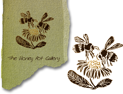
Client: Honey Pot Gallery About: Beryl Bush is a prolific amateur artist. She sells her work for a variety of charities Logo: The logo depicts two honey bees hovering over a daisy The logo was based on a linocut print supplied by the artist. Lemon Productions added sutble colouring and developed the logotype and torn paper look used on the website and other media -

Client: Tech Zone Innovations Product: Skweeze-Tite Pin About: The Skweeze-Tite Pin was a special drawing pin / thumb tack developed by inventor Tony Chamings Logo: The logotype features modern text with a surrounding line, mirroring the use of rubber on the edge of the product The logo was developed by Lemon Productions to create a brand under which the product could be marketed to manufacturers. -

Client: Tech Zone Innovations Product: MotoMake About: MotoMake was a concept board gamedeveloped by inventor Tony Chamings. We were also involved in development of the product Logo: The pill shaped surround was already used on the board's design and trushed metal was added to tie in with the game's industrial theme
We developed the logo to create a brand under which the product could be marketed to manufacturers -

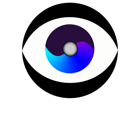
Client: Stephen Finnimore Mental Health Consultant About: Steve Finnimore was a Mental Health Consultant working with the NHS and service users to make sure their needs were addressed Logo: The client had already decided on a ying-yang as the basis of their logo and after seeing several varations, opted for a 3D sphere finish Lemon Productions developed the logo, logotype and colour scheme used through all media -
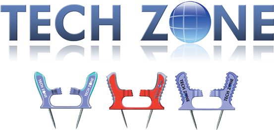
Client: Tech Zone Innovations About: Tech Zone was set up to advertise the inventions of Tony Chamings. This included the Skweeze -Tite pin and MotoMake board game Logo: The logotype was designed to reflect the technology orientated approach of the company. It was used on mock-ups of the company's Skweeze-Tite Pin Lemon Productions created the logo as well as working on various aspects of the products and marketing