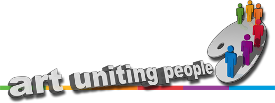
Final Logo
Click the arrows to see how it was developed
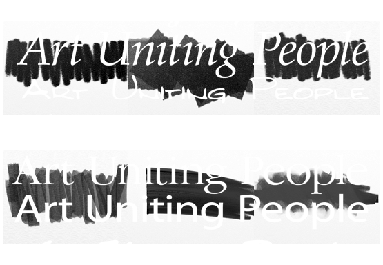
Client: Art Uniting People About: Art Uniting People is a non-profit organisation who put on art exhibitions in Maidstone, showcasing the talents of those around the South East of England including those with mental and physical health issues This is the final logo which is currently used on all advertising, letters, website and on signage at the exhibition
-
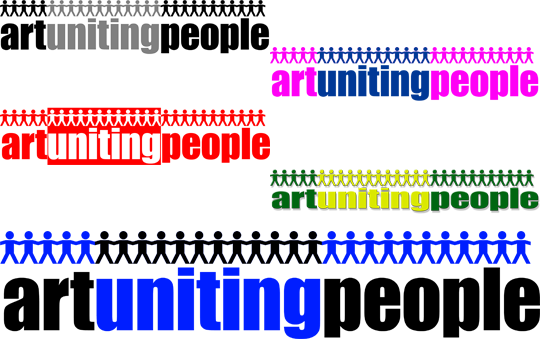 1One of the initial concepts for the Art Uniting People logo.
This version featured a logotype with a paper chain of people along the top.
The client was initially keen on black, blue and red in the design, and we tried variations of this logotype in different colours.
-
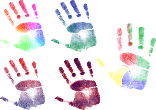 2The client had asked for us to explore the idea of hand prints as a specific idea for the site.
Hand prints represented both the idea of people and of art.
We tried hand prints in various colour combinations.
-
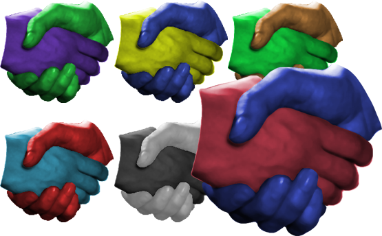 3We were also asked to produce some designs relating to handshakes.
Handshakes were intended to convey unity among people but using abstract colours would represent the artistic aspect.
We produced a page of different colour combinations for the client.
-
 4We presented the client with a range of samples in different fonts to start developing a logotype.
We felt it was important to show the client fonts that conveyed an artistic look.
We also experimented with different artistic textures and scribbles.
-
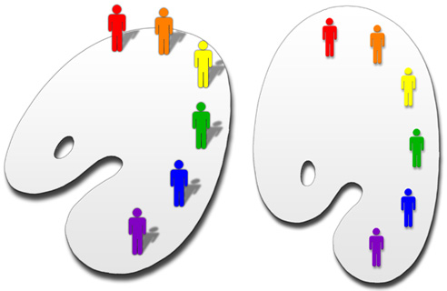 5Among the logos we initially presented, Lemon Productions came up with an idea that had not been suggested by the client.
The idea of multi-coloured men standing on the edge of an artist's pallette was quickly mocked up.
The client was presented with all the designs at a committee meeting and all attendees loved this concept , deciding touse this as the basis for the final logo.
-
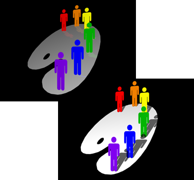 6Having had the go-ahead to develop the pallette idea into finished artwork, we took the logo into a 3D design tool and started working on it.
We made the men relatively larger in comparison with the pallette and experimented with a variety of angles and finishes for the pallette itself.
-
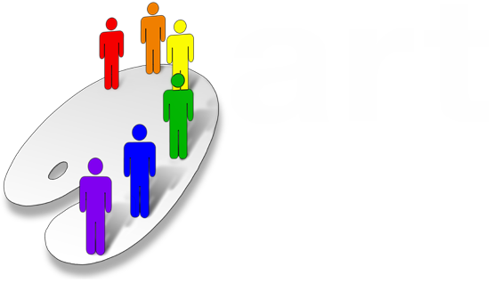 7The finished logo was used for the first two exhibitions in 2009 and 2010.
A simple logotype was chosen to go with the clean logo.
An outline for the men was added to the 3D logo and the shadows were dffused.
-
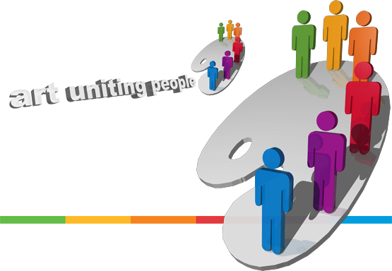 8For the 2011 exhibition, it was decided to revamp the logo with a new colour scheme from green to blue, rather than red to purple, as well as a more 3D look to the people.
The logotype was also given a 3D treatment to make it fit more consitently with the rest of the logo.
A striped band that had been used on the website and letterheads was incorportated to be used with the logo.